My most popular post to date here on The Shed has been my Peeling Paint Technique tutorial. It’s fun to experiment and try different color combinations with this technique.
Recently, I decided to work on a pair of wood frames using the same two paint colors: aqua and orange. Only this time, I wanted to see how similar the frames would look if I switched colors on each frame. For the first frame, I painted aqua as the base color and orange as the top color. I reversed the colors on the second frame, using orange as the base color and aqua as the top color.
You can click here to see the full tutorial on how to do a peeling paint effect, and get all the step-by-steps with lots of helpful images.
The following pictures are meant as an overview and to show the colors before, during, and after.
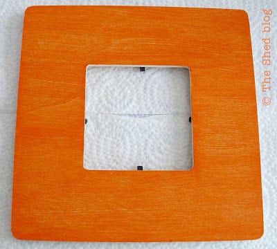
First, I painted my base color. In this example, I painted the wood frame orange:
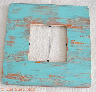
Here’s a shot of how the aqua paint looks after just being painted over the petroleum jelly, which was smeared on once the orange paint was dry:
After letting the aqua layer of paint dry, it’s time to wipe off the paint. What comes off easily is the paint that is sitting on top of the petroleum jelly:
I did the same steps that are in my tutorial for the other frame. Only this time I used aqua as the base color. The orange paint was applied over the petroleum jelly. After the paint was dry, I wiped off the orange paint.
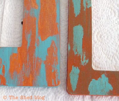
What I didn’t expect was such a difference in how the colors look on each frame:
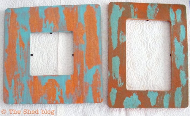 |
| Left frame: orange as base color, aqua as top color. Right frame: aqua as base color, orange on top. |
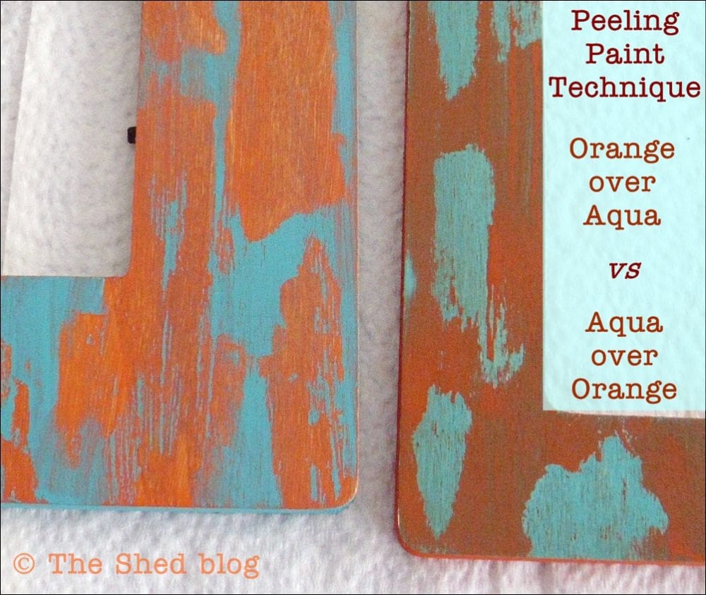
The frame on the left shows a much brighter orange than the frame on the right. And the frame on the right shows a much “greener” shade of aqua than the frame on the left. I used the same paint on each frame, just switched the colors.
I can’t tell you the scientific explanation for this, but it is interesting to see.
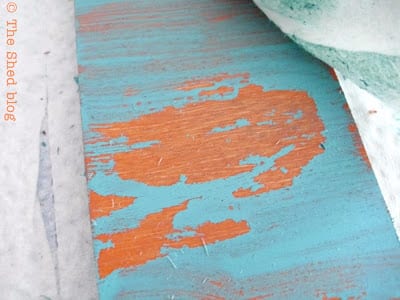
Here’s an up-close-and-personal shot for more detail:
I plan on turning these frames into Halloween frames, and I’ll share some pictures when I’m finished.
So which frame do you like better? Do you have any theories – or scientific facts – as to why these colors look so different on each frame?
Let me know!
~Laura

I am a fan of the orange base. I think the colors appear more vivid. I am also a huge fan of this technique. You are much better at it than me though. Great job!
You’re right Ginger: the colors on the square frame (with the orange base) are identical to what they looked like in their paint bottles. Thanks for the compliment, but I bet if you try it again you’ll be successful!
This is so incredibly cool! the difference is just changing the base coat is amazing!
Thanks Bonnie and Trish! That’s the same reaction I had at first, too! I just couldn’t believe there would be that much of a difference!
I like the orange base too! Such a fun technique Laura…and equally delightful color combo 🙂
Amy*
Thanks Amy! I’ve always loved orange and aqua, and I think it is a fun color scheme for Halloween too – different from the usual orange and black. 🙂
Supa sweet!
Thanks Johnnie! You are supa sweet!